
The Challenge
Design a distinctive identity that merges two core references:
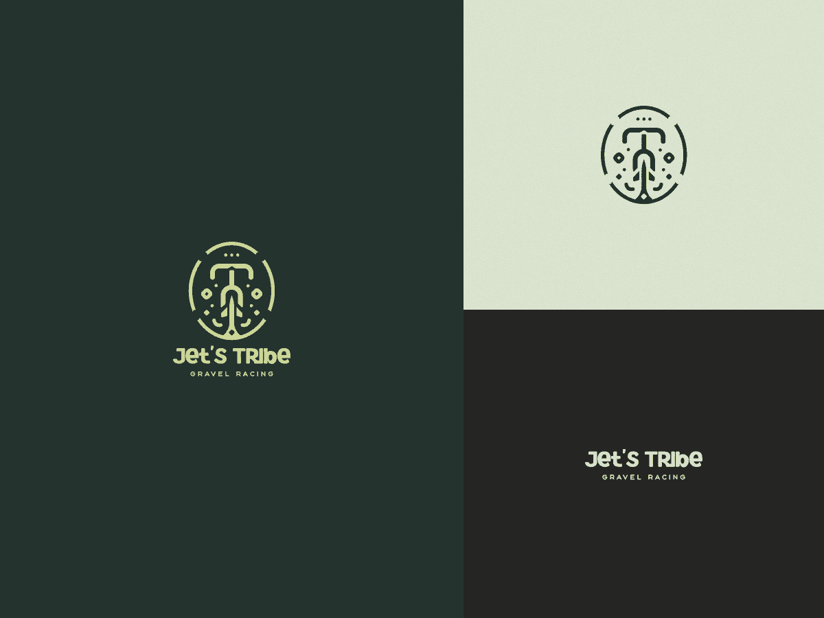
Cycling — reflecting the group’s main activity and gravel racing spirit
A jet aircraft — a direct nod to the name Jet’s Tribe
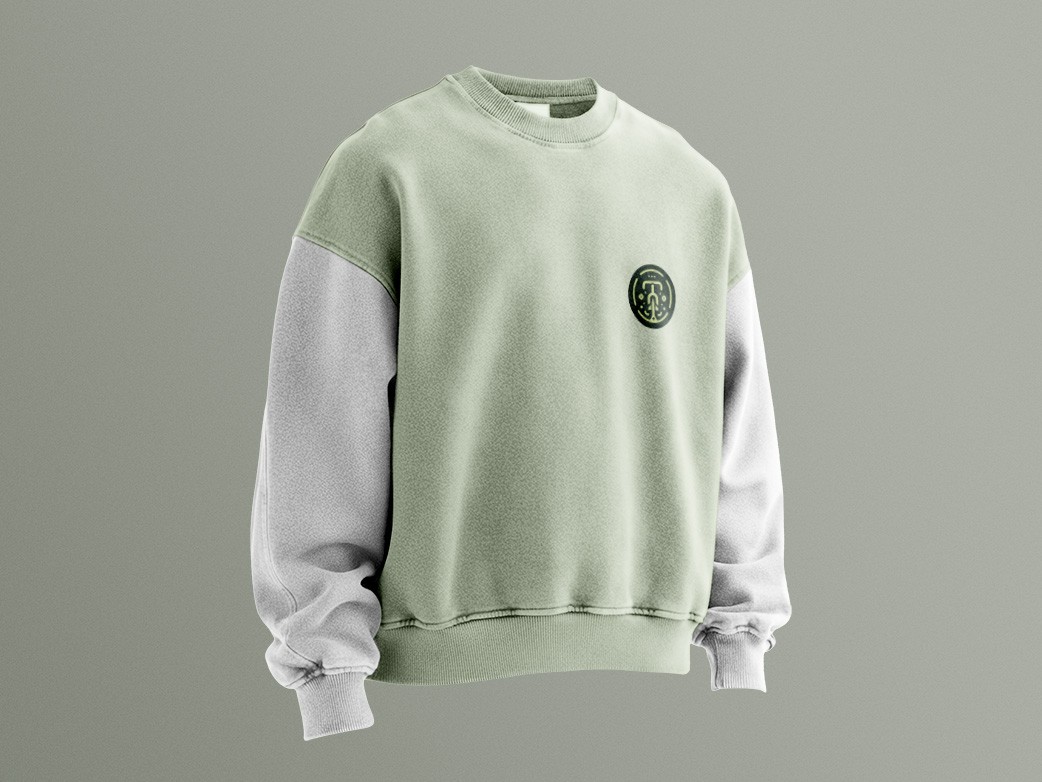
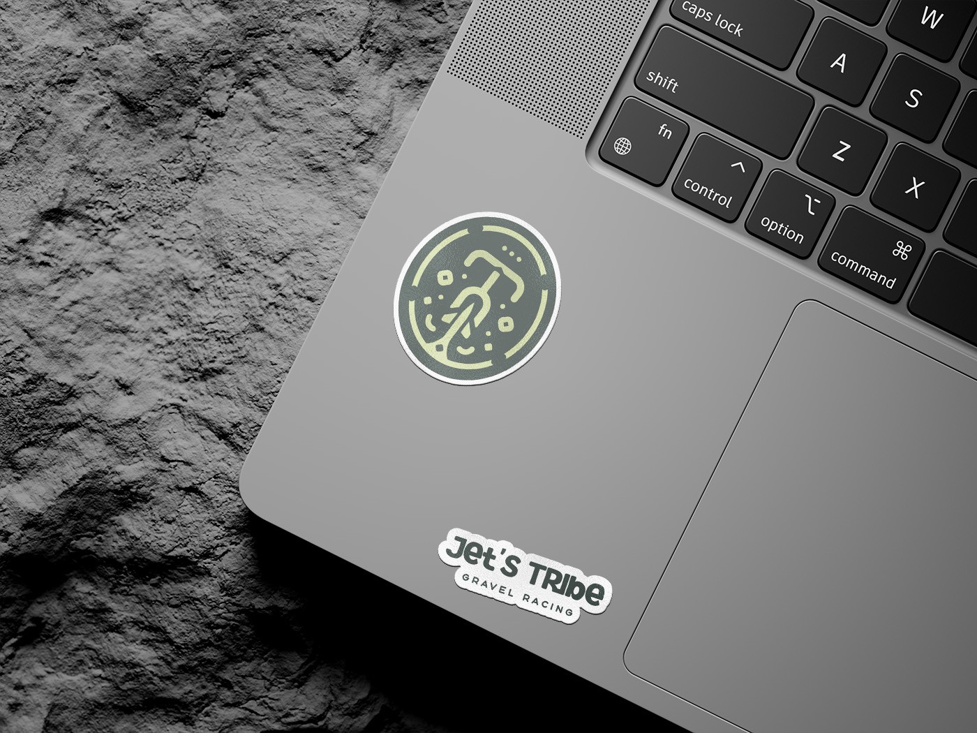
The mark needed to feel dynamic, energetic, and instantly recognizable across digital platforms, merchandise, and event materials.


Most important? The vibe.
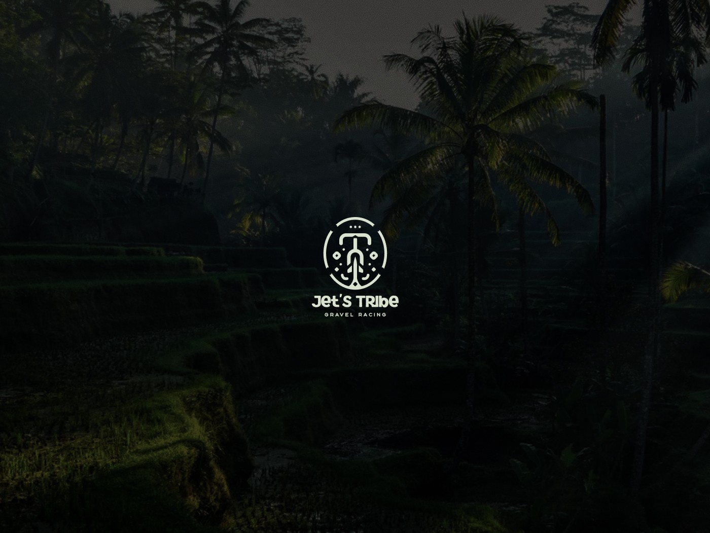
To deepen the identity, the extended visual language embraces an organic, ethnic aesthetic, inspired by Bali’s cultural richness. The forms feel slightly raw and handcrafted, referencing the island’s artistic traditions and the close, almost tribal bond between participants.
The result is more than a race logo — it’s a badge of belonging.
A symbol of movement, local identity, and the growing gravel tribe of Bali.